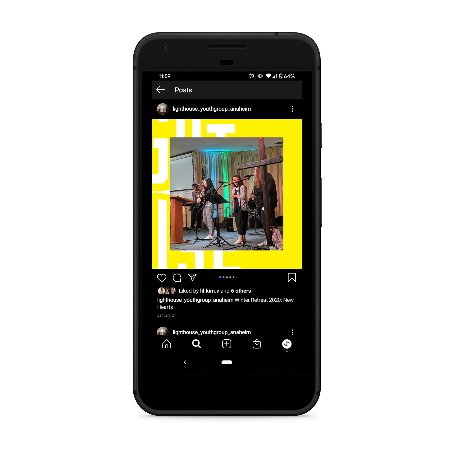
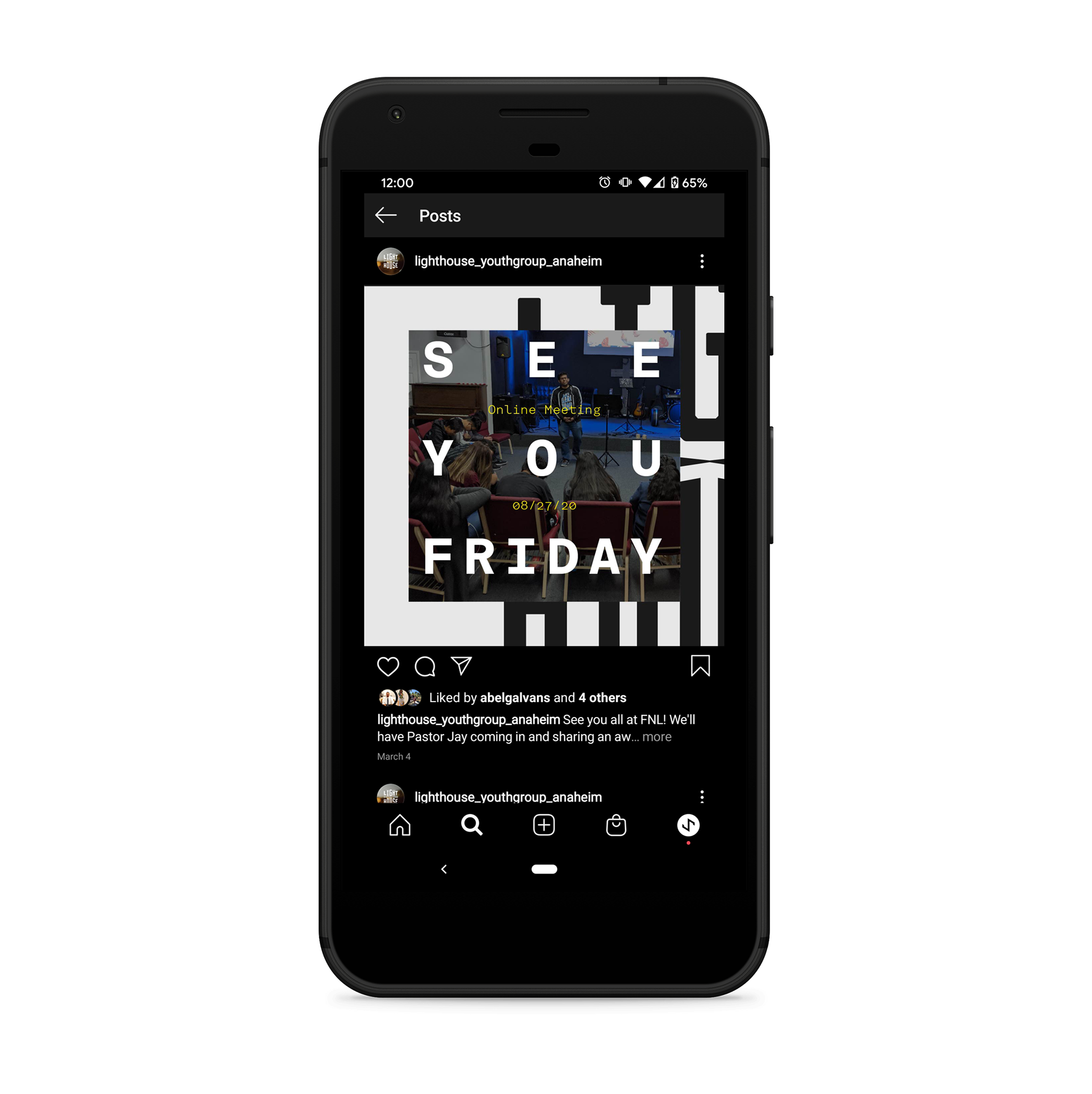
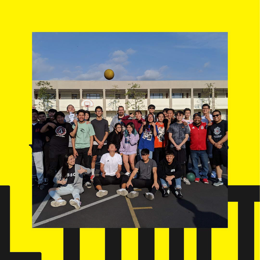
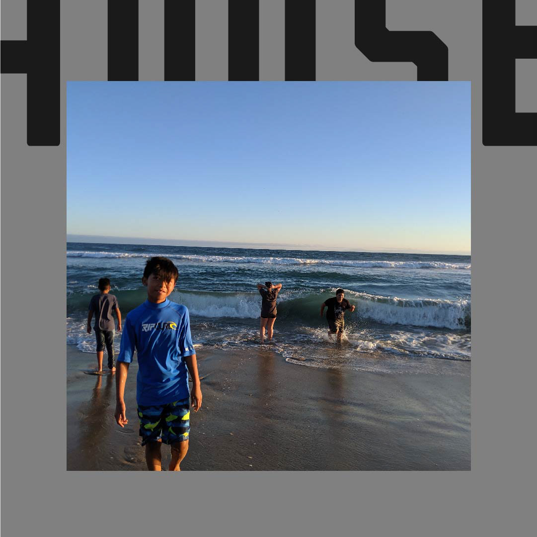
The old group name was too quirky and was not easily understood. This problem is solved by simplifying the name to a real word. The main concept is that you are a light to the lost. This message is hidden within the logotype as the letter "U" functions both as the lighthouse and to reference you/u as a light.
•DESIGN GOAL: Rebrand the group and update the graphics
•SKILLS: Identity Design, Logo Design
•CLIENT: Youth Group of the First Southern Baptist Church of Anaheim and The Thai Church in California
•ROLE: Art Direction and Strategist
Alternative Lockup + Typography
Applications


